Behind every successful business is a secret ingredient. It can be the location, the product, or the owner itself that serves as a lucky charm. In the emerging world of e-commerce, it’s something else. There are what you call “product pages”. That’s the gem of your online business which can make break it.
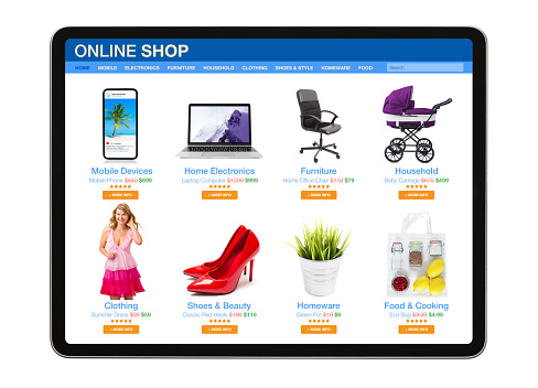
A product page is a page on a website that contains information about the products that a store sells, such as specifications, special features, and others that help customers find answers to their questions about a product. A product page allows you to compare products from various stores, manage how to purchase them, and it may also include reviews.
Now, does having a product page on your website automatically guarantee success? Not. There is still something you need to know and learn to create high-converting product pages. Keep in mind that the power of your product page is in your hands. You are about to enter a huge competition, so you should read the tips listed below.

10 Best Practices in Product Pages
Just like any other print ad you see on billboards, TV, and computer, products pages need to have certain elements, too. Here is a list of the 10 useful elements to have on your product page.
1. Eye-catching headlines. The power of a truly attractive headline can make someone pick up a product and buy it without hesitation. It’s more than just catching the attention but causes an action to be taken due to the appeal created by the headline you used.
2. High-quality product images and videos. To look at the collection of pictures of your product is your customers’ next move after you’re feature image successfully caught their attention. They’ll browse the product gallery to see a shot of its top, side, and bottom to be surer of their decision. The pictures you must include in your product gallery are those that are clean-cut and sharp. Nowadays, the use of some situational photos on a website or a video delivers important messages in your life.
3. Add a trust badge. A seal that indicates the safety of the information shared by your customers when they purchase from your store is a big plus. It creates a solid trust among customers especially those who have decided to make a purchase.This year, some brands like Lush emphasize their being a conscious brand through badges and certifications that reflect their reputation.
4. Adopt customer reviews of products. Trust is very important in the strong connection between the customer and the store. Showing reviews from your previous customers, whether good or bad, make your customers think that you are being honest with your product. By as much as 18%, your revenue can be increased since 80% of people using the internet consult reviews from others before buying anything.
5. Authentic and detailed product description. It is always best to make your product stand out among the many products available online. Customers need to see information such as focus, images, quality products, and reviews.
6. Automated Upsells. Knowing your customers well enough allows you to create a more engaging product page. You can make other product suggestions based on their product, which will lead customers to browse more in your shop. What the customer also looked at, some related products, and what they might like are all important factors in making a strong recommendation. Pop-ups or your chatbot that serves as a guide for shoppers on your website are other ways to endorse similar goods to customers.
7. Add call and chat buttons. These buttons increase conversion in that they entice people to push and make a call or chat with an agent regarding a product. They are very effective at catching attention which leads shoppers to make interaction.
8. Improve website speed. Not everyone has the patience to wait especially when shopping online. Usually, it’s because of the slow internet connection but sometimes it can be due to your website, too. If it takes longer for your content to load, you might lose your customers’ attention until eventually they would go and look for another store. Thus, optimizing your website is what you should do.

9. Simple payment process. Nowadays, there are a lot of means to pay the things you bought online, either through cards or cash. Yet, the process of checking out and placing the order before paying is what seems confusing to some. There are more than 69% of shopping carts are abandoned which cause retailers to lose their sales. This trend today is due to the complicated checkout process.
10. Indicate shipping cost. The majority of shoppers online always remember the shipping fee. It’s natural for them to check the amount of fee needed for that certain order. Showing them the shipping cost before they check out is somehow a relief for them.
Enhancing Your Product Page
If you think you already have all those elements on your product page, then maybe it’s just about revolutionizing how you present them. This 2022, such traditional ways of presenting those elements may no longer work well for your product.
You might need to add something or to remove something in order to truly achieve the product page that you desire. For instance, in Glossier’s ads this 2022, they keep it minimal in words and in images, just like a simple email. To help you out, here is a list of steps to follow in creating a more impactful product page.

- Keeping Your SEO Updated. For generating leads as well as for building and promoting your product online, using SEO remains to be the most affordable strategy to use. Powerful keywords and phrases help enrich the impact of your SEO as it makes your product always on top. Keep in mind the purpose of your SEO and ensure that all those keywords are there when customers search about them on the search engines.
- Curb the size of the feature images. No one likes to use a phone that hangs when you’re browsing products online. Not all devices such as mobile phones have the same capacity and thus require you to use only images that have the size that fits all types. Your images should be optimized for desktop and mobile use.
- Practice uniformity in everything. Consistency takes a long way. People know if you can be trusted when you can keep your style and form similar. This way, you can create an orderly appeal to visitors, making them have an easy way of navigating the page to look at all the contents.
More Traffic. More Conversion.
Don’t let the big world of eCommerce beat your desire to get attention. If making a product page that’s more on images and fewer words, go ahead! Do whatever it takes to top the search. The competition never stops and you must be able to keep up. The most important thing is to maintain your conversion rate and to keep the traffic going.

